Geometric comic illustrations
Use this guide for model heroes, explainers, diagrams and comic sequences. Choose the detail level by the object's size and the information being shown.
Choose the style
| Style | Use for | Detail | References |
|---|---|---|---|
| Simplified icons | Informational graphics, scenes with several objects, diagrams and sequences | Flat silhouettes with the fewest shapes needed for recognition and essential features only | RF-DETR Nano |
| Detailed illustrations | Large focal subjects, single-object heroes, close-ups and explanations of features or defects | More facets and selected facial, structural or diagnostic features; quieter unrelated areas | ResNet-50 |
A hero containing several small objects still uses the simplified style. Add detail when the subject has enough space and it helps explain something: a vehicle in a scene needs a simple silhouette; a close-up explaining a wheel or a defect needs the relevant parts.
Establish the structure
- Default to a front or flat side view. Use shallow perspective only when needed to explain depth or a functional part. Keep connected parts aligned, correctly proportioned and consistent in perspective; preserve symmetry where the object requires it.
- Define the silhouette and key functional parts first. A laptop needs a rectangular screen and a centered base; a cup needs a visible handle. Objects must be identifiable without reading their labels.
- Use the fewest shapes needed for recognition. Represent keyboards, grilles and similar repeated details as one solid area in simplified icons. Add a detail only when it improves recognition at thumbnail size.
- Check the silhouette and functional geometry without labels at a thumbnail size such as 300×120 before adding color facets.
- Apply color facets within the established structure. Preserve the outer contour, proportions, symmetry and functional openings. Keep rectangular screens rectangular and a laptop's screen and base on a shared centerline.
Shared rules
- Build broad facets from horizontal, vertical and repeated 45-degree diagonals, inspired by the supplied SiMa.ai references. Allow circles, arcs and small curves where anatomy or mechanical function needs them.
- Use expressive eyes and a contrasting mouth where faces matter.
- Use a muted natural skin tone for each person's face, ears, neck, hands and other exposed skin. Keep that tone consistent across the person, with one solid fill and black facial features. Put corporate accents in clothing and accessories. Do not use white, teal or other brand accents as skin.
- Use crisp, continuous boundaries and solid color regions. Remove speckles, grain, stray pixels and edge halos, including artifacts introduced by palette remapping. Simplification should preserve a deliberate, finished shape.
- Pair blue/lavender/black, orange/teal/black or green/teal/lime within connected planes. Use a few colors per object rather than every accent everywhere.
- Use neutral backgrounds, generous spacing and restrained scenery. No logos, wordmarks, photographic textures, lighting effects, gradients, glows or shadows. Base illustrations are opaque; segmentation masks are the exception below.
Colors
Use these ten brand colors for objects, clothing, backgrounds and annotations. Exposed human skin has the narrow exception below; do not add other colors, shades or tints. Background/text combinations follow the supplied brand table; prefer black on a neutral background for small copy. These are brand pairings, not a blanket accessibility claim.
| Background | Hex | Permitted text colors |
|---|---|---|
| Gray | #F3F4F5 | Black, orange, blue, green |
| Gray | #E8E9EB | Black, orange, blue, green |
| White | #FFFFFF | Black, orange, blue, green |
| Black | #010F0E | White, #F3F4F5, lavender, teal, lime |
| Orange | #D26728 | White |
| Lavender | #D1CEE6 | Black |
| Blue | #5998DD | White |
| Teal | #C0E8DB | Black |
| Green | #2A9C4F | White |
| Lime | #A4CC2D | Black |
Use palette.svg for export.
The following three skin tones are an intentional exception limited to exposed
human skin. The brand palette remains the ten colors above; scenes without
people use that ten-color palette.
For this exception, choose one of #E4B493 (light), #BC8768
(medium) or #8C624D (deep). Use varied tones across groups of people, keeping
each person's face and hands consistent. Use flat fills without blush,
highlights or extra skin facets. Keep these colors out of clothing, objects,
backgrounds, annotations and text.
The palette with skin tones
includes this exception for scenes containing people.
Translucent segmentation masks may blend a palette color with the artwork beneath, only within the mask region and its edge. A filled person mask may tint the natural skin tone with its class color, just as it tints the person's clothing.
Typography
Use Roboto for every title, label and caption. Typeset lettering after generating the illustration; do not accept AI-generated lettering or a fallback font.
Use Light 300 for large editorial headings, Regular 400 for body copy, Medium 500 for labels and Bold 700 for emphasis. At 1200×480, use 40 px Medium labels with consistent padding; a classification result can use 40 px Bold with 32 px Regular alternatives. Do not condense or stretch the font.
Install Roboto from Google Fonts if it is not available in your design tool.
Prediction overlays
- Give each different class in an image a different corporate color. Repeated instances keep that color across the image or sequence.
- Choose annotation colors that contrast with the object's main illustration colors, and plan this before coloring the scene. Different class colors alone are insufficient if they blend into their objects. For example, use orange for a green plant and green for a blue/black laptop. Use the same class color for its mask, outline, box and label background; follow the text pairings above.
- Detection boxes fit tightly around objects. Segmentation also needs a visible filled mask following the silhouette, leaving the background and gaps between object parts unmasked.
- Draw boxes and labels after all base-art cleanup. Keep all four box edges visible, including the bottom border where an object meets the floor.
- Start with 35% mask opacity, adjustable within 25–40%. Keep outlines, boxes and labels opaque; a 3 px outline is a useful starting point at 1200×480.
- Use direct labels so color is not the only source of meaning. Examples must not imply measured accuracy or invent confidence scores.
For other explainers, use one message per graphic and one action per panel. Keep a consistent reading direction and clear connectors. In comparisons, hold the object's scale and viewpoint constant and change the relevant attribute.
Reference heroes
Use the finished models/<id>/hero.png files as visual references.
| Example | Hero | Preserve |
|---|---|---|
| Detailed focal subject | ResNet-50 | Seated cat silhouette, curled tail, expressive eyes and visible mouth |
| Simplified objects | RF-DETR Nano | Front-on rectangular laptop screen, short centered trapezoid base and one solid keyboard area |
| Detection | RF-DETR Small | Simple scene, tight boxes and distinct class colors |
| Segmentation | YOLO26m Seg | Filled class masks, visible contours and unmasked gaps |
| Pose | YOLO26n Pose | Readable simplified people and clearly visible skeleton overlays |
| Input/output explanation | Whisper Small | Clear reading direction and explicit input and output |
Simplified construction — front-on laptop

Classification — detailed focal subject
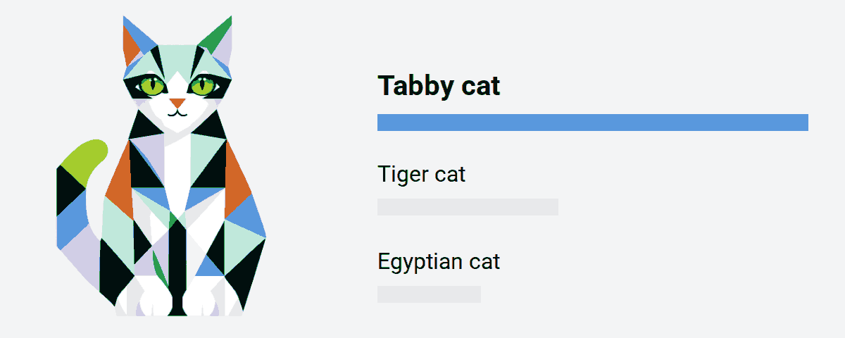
Reusable prompt
Attach a reference hero and choose one style instruction:
- Simplified: a clear flat silhouette with the fewest shapes needed for recognition; group repeated details such as a keyboard into one solid area. Omit individual fingers, fine mechanics and fabric folds.
- Detailed: a large focal subject with more geometric facets and selected facial, structural or diagnostic features; emphasize the relevant part and leave unrelated areas quieter.
Insert that instruction into this shared template:
Create [SUBJECT] for [PURPOSE] in the approved geometric comic style.
[STYLE INSTRUCTION]
Use [FRONT OR SIDE VIEW; SHALLOW PERSPECTIVE ONLY IF NEEDED].
Construct [KEY PARTS AND THEIR ALIGNMENT] with recognizable proportions,
consistent perspective and symmetry where appropriate.
Make the silhouette and functional parts readable without labels at 300×120.
Apply broad color facets within that structure, preserving its outline,
proportions and functional openings. Use horizontal/vertical edges and
repeated 45-degree diagonals for the facets. Allow circles and small curves
where recognition needs them.
Use crisp boundaries and flat fills, without grain, speckles or halos.
Use #F3F4F5 #E8E9EB #FFFFFF #010F0E #D26728 #D1CEE6
#5998DD #C0E8DB #2A9C4F #A4CC2D for clothing, objects, backgrounds,
annotations and text, with a few colors per subject.
Background #F3F4F5, clear margins, complete subject within frame.
No logos, lettering, realistic materials, arbitrary microfacets, gradients,
glows, transparency or shadows in the base illustration.
Keep [ESSENTIAL FEATURES]. Omit [UNNECESSARY DETAILS].
The intentional palette exception is exposed human skin: use one muted natural
skin tone per person, #E4B493, #BC8768 or #8C624D, only on exposed skin.
Keep each person's face and hands the same
tone, with black hair and facial features and corporate colors for clothing.
Prediction overlays and actual Roboto lettering will be composed separately.
Export and review
Preserve the model's subjects, output semantics and architecture accent in the base artwork. Follow the class-color rule for prediction overlays.
Export model heroes as regular, metadata-stripped 1200×480 PNGs no larger than
2 MiB at models/<id>/hero.png. Documentation and hero changes must not change
compilation or benchmark fingerprints.
Normalize opaque artwork and lettering to the palette after the final resize, without dithering. From the repository root:
convert docs/assets/illustration-guide/palette.svg -alpha off /tmp/hero-palette.png
convert /path/to/composed-hero.png -alpha off \
  +dither -remap /tmp/hero-palette.png -strip PNG8:/path/to/hero.png
For scenes containing people, use palette-with-skin.svg in that command.
Check that the three additional colors occur only on exposed human skin.
For segmentation, normalize the base first, then composite the translucent masks and export a metadata-stripped RGB PNG. Do not remap the blended masks afterward.
Review the final PNG at 1200×480 and at a thumbnail size such as 300×120.
Temporarily hide labels to check object recognition, then check annotation
contrast and label readability. Check that the chosen view, proportions,
symmetry and alignment remain consistent after adding facets. Inspect edges at
native resolution after palette remapping and clean up any noise or broken
contours. Passing a palette check does not establish visual quality. Also check
geometry, facial contrast, mechanical plausibility and mask alignment. Verify
Roboto loaded and pixels outside masks and their edges use only the approved
colors. Then run model-registry validate-models --repository ., which checks
the hero's size, dimensions, and PNG format. Model README
lists the hero rules.